TILwithArtLounge: Create Stunning Impasto Art Using Gesso and Acrylic Paints!

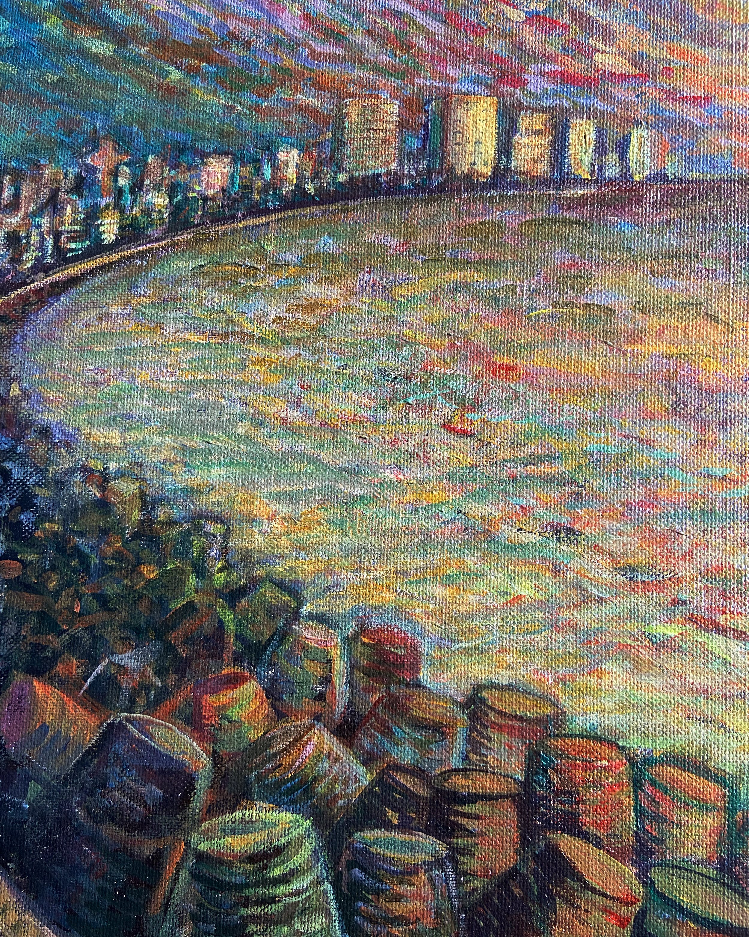
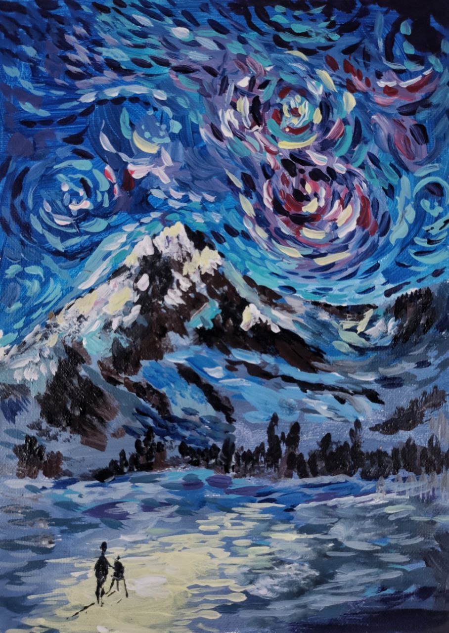
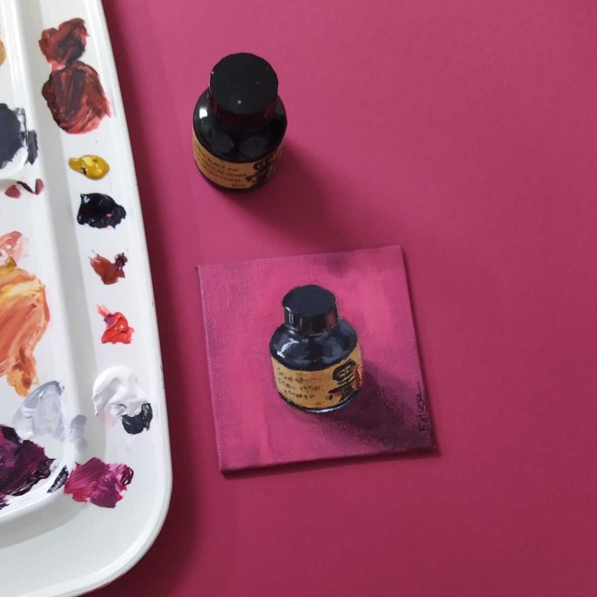
Impasto painting is a technique that involves applying thick layers of paint to create texture and three-dimensional effects on a canvas. By combining gesso and acrylic paints, you can achieve remarkable impasto effects that add depth and visual interest to your artwork.

In this blog post, we will guide you through the process of creating stunning impasto paintings using gesso and high-quality acrylic paints.

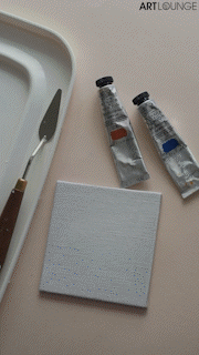
Materials Needed: Mijello Mission Permanent Gesso, Winsor & Newton Professional Acrylic Paints, RGM Palette knife, Canvas or painting surface, Paper towels or cloth.
Optional: Brushes for blending or additional detailing

Let’s begin!
1. Mixing the Gesso and Acrylic Paint:
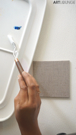
Using RGM plus line- palette knife, take a small amount of Mijello Mission Permanent Gesso and the desired Winsor & Newton Professional Acrylic paint color. For a pastel color effect, mix approximately 2 parts acrylic paint with 8 parts gesso. Adjust the proportions as desired to achieve your preferred color intensity and blend it thoroughly.

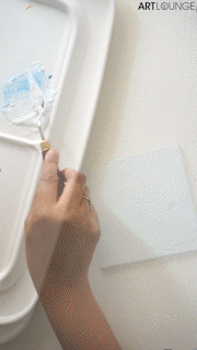
2. Using the palette knife, scoop a small amount of the gesso and acrylic paint mixture onto the palette knife's edge. Apply it to the canvas, just as you would with a regular impasto technique. Experiment with different strokes and techniques to create various textures and effects.
Note: Allow the applied paint to dry completely before adding another layer or a different color. This prevents smudging or unintentional mixing of colors.
After each application, wipe off any excess paint from the palette knife using a paper towel or cloth. This ensures that the palette knife remains clean and avoids color contamination.

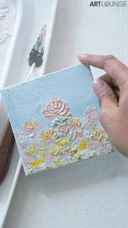
3. Continue the process of applying layers of gesso and acrylic paint, allowing each layer to dry before adding the next. Feel free to experiment with different colors, strokes, and textures to create a unique and visually captivating impasto painting.

Creating impasto art using gesso and acrylic paints is a fascinating and rewarding process. The combination of these materials allows you to add texture, depth, and visual interest to your paintings.

Remember to follow the tips mentioned in this blog, such as allowing proper drying time and cleaning the palette knife between colors.
So go ahead, grab your gesso and acrylic paints, and explore the world of impasto art. We can't wait to see your amazing creations!
Don't forget to tag us when you share your artwork.

Happy painting!.

Source: https://www.artlounge.in/

Mumbai Urban Art Festival at the Sassoon Dock, Mumbai

Mumbai Urban Art Festival at the Sassoon docks is an art project by St+art India foundation, in association with Asian Paints. The festival theme is 'Between the Sea and the City' and is inspired by the city's sea-related history. With 30+ artists from around the world coming to create art that embraces and tells the stories of the sea, this dock and the Koli community.

Image Courtesy: Vinayak Bhatt

Ayaz Basrai's 'the magic cube' is the artist's take on what functional homes can look like even in the future when living out of compact homes and furniture that actively participates in the lives of the people that occupy it.

Senkoe's lively murals are a celebration of Mexican and Indian culture with colours, textures and patterns.

Amrit Pal Singh's 'toy faces' has an elaborate setting with a lot of Texture, Lights, Forms, Creating just the right setting for this display.

Sassoon Dock Art Project- Intuitions. Mural by Andha Ras

Ras's Mural is a big highlight of the festival. The blue, resembling the sea calls to you and one must step forward for a closer view!

(Stay tuned to our blogs to know more about Andha Ras’s work process)

Sassoon Dock Art Project- Illusions

Photo Courtesy: Manish Yadav

Dennis Fabian's interactive art piece is awe striking in every sense of the word. We'll be publishing a blog on Dennis's answers to our top questions and you should not miss it!

To quote from our interview with the artist "I deeply enjoy the field of interaction design, and how we as humans interact with our environment. I like to evoke a sense of awe within my viewers".

And his work does that, indeed!

Pipes and Leaks by Sajid Wajid Shaikh and Ronak Soni

Photo Courtesy: Sati Tukadiya

A steady sound of water would also be present for most of this event. This is from the installation of Sajid Wajid Shaikh and Ronak Soni's Pipes and Leaks.

Photo Courtesy: Sati Tukadiya

Large-scale, site-specific, and experimental, the artworks are intended to immerse the observer in reflections between the sea and the city. They range from murals to technologically backed functional art.

Refraction of Reflections

Photo Courtesy: Sohil Belim

Colourful murals enhance this incredibly distinctive location and connect visitors to the three interactive displays inside- Art House, Intuitions and Illusions.

Metromorphosis by Sameer Kulavoor and Sandeep Meher

Photo Courtesy: Sohil Belim

Fishing to these diverse communities isn't just an occupation but a way of life, and their heritage even predates the city of Mumbai itself. The Art here celebrates their story, life, livelihood, community, culture and puts it on display for us.

Photo Courtesy: Kedar Deshpande

The smell of fish is an inseparable part of this city and it acts as an active part of the experience at the dock and the exhibit.

Photo Courtesy: Vinayak Bhatt

What are your thoughts on Mumbai Urban Art Festival 2023? Comment them below.

And for all the Street Art enthusiasts, we have a surprise!

Our Kalaghoda, Mumbai Store has the best prices for all your art supply needs!

We have Montana Gold, Black, Ultra-wide, Marble, Granit, Crackle, Metallic, Acrylic Markers and refills all at 25% discount.

(Note: In-store offer only)

Top 10 entries for Postcards from Home: Van Gogh Style Contest

This contest was for fun and to challenge ourselves. Not everyone can win. Art is subjective. It was an extremely tough decision with such beautiful entries. We went with those who captured Van Gogh's style and yet reflected their city.

We would like to thank all the participants for sharing their wonderful work and encourage you to continue creating, curating and collaborating!

Here are our Top 10 picks, enjoy :D

1. Mrunmayee Malabika

2. Sefi George

3. Abhinav Dhole

4. Kruti Gandhi

5. Antara Pain

6. Stuti

7. Simham Samuel

8. Prem Singh

9. Sunil Pund

10. Dilsha Daniel

Thank you for taking the time to create these beautiful works around the contest theme, we loved the enthusiasm!

The Potato Eaters: Painting Analysis

Artist: Vincent Van Gogh

Van Gogh saw the Potato Eaters as a showpiece, for which he deliberately chose a difficult composition to prove he was on his way to becoming a good figure painter.

They are in a dark room and the only light source comes from the oil lamp hanging from the beams of the ceiling. The lamp is situated almost in the centre of the painting and it illuminates the room.

The message of the painting was more important to Van Gogh than correct anatomy or technical perfection. He was very pleased with the result: yet his painting drew considerable criticism because its colours were so dark and the figures full of mistakes.

The subjects have coarse and protruding features, which are distinctive characteristics of peasants. Their figures are bony. Van Gogh was trying to portray the ordinary, poor and tough lives of the peasants.

Although the painting is dominated by dark and gloomy colors, the facial expressions of the peasants shine out brightly, revealing their mixed inner emotions. Their expressions are very serious and solemn, and they do not seem to be very happy.

The colors used are mainly dull colors such as brown and black, giving a depressing and melancholy feeling to the painting. The earthy tones resemble the coarse, sunburnt face of the peasants.

The composition of the painting is carefully arranged. The painting is almost symmetrical in the way the figures are positioned, as they are distributed geometrically.

The ceiling is low and close to the peasants, the room is also small and shabby, creating a sense of oppression.

Vincent wrote that he wanted people to

“get the idea that these folk, who are eating their potatoes by the light of their little lamp, have tilled the earth themselves with these hands they are putting in the dish, and so it speaks of MANUAL LABOUR and – that they have thus honestly earned their food”.

A letter from Vincent Van Gogh to his brother Theo Van Gogh, dated Thursday, 9 April 1885.

The letter includes a sketch of The Potato Eaters.

Studies of Hands by Vincent (two of them holding forks)

A Lithograph of The Potato Eaters by Vincent (1885)

What does this painting make you feel?

Do you think Vincent did justice to the subjects he was painting? Share your thoughts in the comments!

Woman with a Parasol: Painting analysis

Artist: Oscar-Claude Monet

In 'The Woman with a Parasol' painting Monet has painted his first wife Camille and elder son, Jean.

The entire composition has movement to it, the way Camille is standing in the wind and the way Monet painted the flowing ribbons here and there all add to the dynamism.

This painting needs to be viewed from afar and from close to feel the depth of Monet’s fleeting moment. Monet utilized darker shades of colors to give the impression of the shadows that come alive with colors, yet Monet still conveyed the contrast in light and dark.

The sky and clouds are painted in what appears to be predominantly white and blue, but if we look closer, we will see how Monet applied grays too to depict the interplay of light and shadow.

His use of wider and thicker brushstrokes gives the impression of more light.

Although Camille’s dress is white, we see various colors, which are indicative of the shadow falling on her.

Monet painted the scene from a lower point of view. Camille is looking down at Monet, and ultimately at the viewers, we are also met with the largely blue sky behind her.

Monet’s beautiful artistry and ability to capture a moment in time with a paintbrush, breathing life into his compositions with each brushstroke

What do you think of Monet’s masterpiece?

Do you feel the movement that Monet’s brushwork wanted us to feel? Share your thoughts in the comments!

CONTEST TIME: Postcards from Home- Van Gogh Style

To honour one of our favourites, Vincent Van Gogh and in anticipation of the Van Gogh 360° exhibit coming to Mumbai in 2023, we are launching the #GoghWithArtLounge contest!

There are 3 Art Lounge vouchers up for grabs

  1. INR 3500/-

  2. INR 2500/-

  3. INR 1500/-

It's so easy to participate!

Just introduce us to your city by creating Artworks in Van Gogh's impressionist style that uses streaks of colours laid together to create movement.

Rules and Guidelines for the Contest

  • Deadline: 31st January 2023

  • Age: 12+

  • Size: A5, A4, A3 or A2

  • Surface: Paper, Canvas or Fabric

  • Acceptable Mediums: Acrylics, Oils, Watercolours, Coloured Pencils, Coloured Paper Collage, Gouache, pastels, Fabric Paints, Inks, Markers, Fineliners.

  • Number of entries: Multiple entries are allowed.

  • To submit your entry, post your final artworks to Instagram or Facebook with #GoghWithArtLounge. Alternatively, you can email us your entries to pratigya.berwal@artlounge.in

  • Entries will be accessed based on proximity to Van Gogh's style, translation of the city/town/village/area, composition, technique and use of colours.

Contest is open to Indian Residents only.

Art Lounge reserves the right to edit and/or cancel the contest at any point.

Art Lounge abides by the decisions of our in-house artist team and their choice for winners and they may alter the winner(s) if unfair practices are used.

Graffiti in India through the years

Have you ever been driving when you caught a glimpse of an artwork on a building? Would you classify that as vandalism or art? Graffiti is when someone writes or draws something without authorization and in plain sight on a wall or another surface. Where, then, does the distinction between vandalism and art lie? Ironically, a graffiti artwork is the first image that appears when you search for vandalism.

In our society, people immediately take action to stop graffiti in whatever form. Most people have convinced themselves that graffiti is vandalism. A spray paint can is merely a tool, used by artists to produce works of art. Graffiti is a medium for mass communication, just like other painting tools. It can get a person's opinions and voices heard in an anonymous way, and get people talking. Graffiti has much more power than we think.

These days though, Graffiti has gained a lot more prominence than before in India. Indian Graffiti artists have completely turned around the table with their talent. Starting from current affairs, political issues, mythology and even contemporary, these artists have covered it all. Moreover Graffiti and Murals should not be new concepts for Indians. The first mural to be traced back in time would be in the 2nd century BC, a Buddhist Cave Painting discovered in the Ajanta Caves, Maharashtra. Also, when we do visit rural regions of our country we would find local people painting their mud-huts with colourful designs and sometimes even murals for decorative purposes. Also in the 80’s and 90’s we would find hand painted Bollywood movie posters everywhere around the country. All of these instances suggests that art can be visualised and conveyed through anything be it a canvas or a simple wall.

Source- Pinterest

Source- scroll.in

Street Art/Graffiti came into purpose only after 1980’s in India. Previously wall art only meant political parties hiring artists to paint walls for promoting their parties. West Bengal is an extremely politically driven state. Even now in parts of Bengal every year during the time of election process you would find walls being painted with party symbols and slogans.

Retired banner artist and art critic, V.Jeevananthan from Coimbatore, also agrees to the fact that wall paintings back at his time in the late 1960’s were only limited to commercial and political purposes only. Wall Art in Coimbatore is a very recent trend which started around 4-5 years back.

Source-BBC News

Graffiti practices started increasing in the regions of Delhi and Mumbai from the year of 2006 or 2007, when artists such as Yantra, Daku and Zine started painting off the cities and gaining prominence and attention. With the advent of street artists, street art festivals were also organized around different parts of the country. For example, St+Art India Foundation gathers a good support from various artists across the country and keep organizing various events with them and for them. The whole purpose of this foundation is to create murals to beautify public spaces but with due permission and as well give recognition to the artists within the process. The Delhi, Shillong and The Kolkata Art Festival by Jogen Choudhury have also added to the promotion of street artists.

Some of the must visit places to see and explore street art in India are as follows-

  • Fort Kochi, Cochin has some of the most amazing street art across the country. Fort Kochi gets its resemblance and identity from the beautiful street art it has been hosting for so many years. They host art festivals and ceremonies in Kochi and adjoining Mattancherry region. The first one was annual exhibition of Kochi-Muziris Biennale 2012.

In frame-Kochi Wall Art, Source-Kochiconnect.in

  • Delhi has some epic street art and artists. The dull streets and pathways in Delhi has been consistently replacing themselves with amazing eye gagging street art for the last few years. The Lodhi Street is one of the best examples of how artists have showcased their talent through street art. St+Art Foundation in Delhi, which showcases Street art and artists, i is also one of the main reasons behind this change.

In frame-Lodhii Wall Art, Delhi, Source-Thinkingthefuture.com

  • Kolkata is a city which has been always known for it’s culture, heritage, politics etc. Street Art has taken over the walls of Kolkata as well. The Street art Festival organized in Kolkata every year is also a must visit for all artists. Some of the most famous streets would include names of park Street, Loudon Street, St. Lawrence High School etc.

In frame-Kolkata Street Art Festival, Source-aninews.in

  • Bandra, Mumbai is one of the busiest and hustle filled places in India. But along with the hustle goes on the creativity as well. Apart from the many museums present here to display art, it can just be seen on the streets everywhere. The other places which brim of inspiration, art and color would also include Mahim, Dharavi etc.

In frame- Street Art in Bandra, Source-azureskyfollows.com

  • Other must visit places for exploring Street Art would definitely include Bangalore, Chennai, Thrissur, Gokarna, French colony (Pondicherry) etc.

Graffiti is such an art form that is not legalized and considered vandalism in many parts of the world including India. But for the last few years as it is gaining prominence over the country, so are the artists. Many artists prefer to keep their names hidden or keep a pseudo name for this same reason as well. Some of the most famous artists will include names like Wicked Broz, Daku, Zine, Yantr, Zake, Mel and a lot more.

Daku whose name means ‘bandit’ is a street artist from Bangalore known since 2013, for his artworks which mocked the system. He is recognized as one of the pioneers of street art in India.

Source-Indianexpress.com

Zake is another notable 20 year old, street artist from Mumbai who has won several awards for his artworks here and abroad.

Source-inuth.com

There are around more than 10 styles of Graffiti art present today. 5 of the most popular styles would be-

  • TAGGING- Tagging is one of the most simple, easy and recognized form of Graffiti. These days taggers use Graffiti for easy fame as they mark their own territory by tagging their names everywhere. This style uses only one color. It is considered to be disrespectful to tag on some another artists Graffiti.

In frame- Tagging Graffiti, Source-artsuppluguide.co.uk

  • PIECE/ CHARACTER- Piece is actually the short form of “Masterpiece’. As the name suggests the artists make this form of graffiti free-hand. It is time-consuming and requires much more effort than the other forms of graffiti.

In frame- Piece Graffiti, Art Lounge, Kala Ghoda Store

  • STENCIL GRAFFITI- As the name suggests a Stencil Graffiti uses stencils made out of cardboards, paper etc. Then the artist will spray paint against the cut-out accordingly. These stencils can be of anything be it text, image, numbers etc.

In frame- Stencil Graffiti, Source-dreamstime.com

  • POSTERS/ POST-UPS- Posters or post-ups are a quick and convenient form of graffiti art. The artists generally make the posters at their homes and then just stick it out on different locations. Like Stencil Graffiti these can also be used for mass replications.

In frame- Poster Graffiti, Source- needpix.com

  • LETTERING- Lettering has been one of the most common forms of Graffiti for the longest time. There are so many sub-groups under this category as well which include Wild Style, Blockbuster, Bubbles and Sharp.

In frame- Lettering Graffiti (Type-Blockbuster), Source-journeyforevermag.com

Ever wondered what tools and paints these artists explore through to make such wonders? Ever thought of taking a spray-can and just paint the biggest wall you see next. The basic toolset for making Graffiti includes paint spray cans, chalks for outlining, stencils for delicate designs, markers, brushes, nozzles and masks for protection from chemical hues while painting.

Montana Spray Cans gives you exactly what you want. Artists like Mel (@melsmake) use Montana Spray Cans for its easy application on large surfaces. Montana Markers and Nozzles are very helpful for making thick or thin strokes according to the need of the artist as well. When in need of a refill, Montana has a series of colour refills too. So what are you waiting for? Grab a can now!

Art Lounge and Montana Cans collaborated in the year of 2019 for the event “Graffiti Jam”. India’s top Graffiti artists participated in the event and made it successful. They created beautiful artworks, all in their different unique styles at our Kala Ghoda Store.

Create with Art Lounge - Ink Bottle Edition

Painting from life is far different from painting using photo as reference. You must rely on your observation and can’t have camera doing most of the work for you.

Any seasoned Artist will tell you that to sharpen your skills as an Artist, you should practice painting from life. It can be still life, portrait, figure painting or plein air painting.

Let’s start small today by painting an ink bottle in Acrylic on Canvas. We’re using Pebeo Studio Acrylic on 4x4 inch Canvas with Art Essentials and Winsor and Newton Brushes.

We’re using a limited palette of

Step 1

We will mark the proportions of our Subject. This is fairly easy for an Ink bottle. Here, instead of using a pencil, we’ve watered down a combination of Burnt Sienna and Yellow Chrome. If you’re comfortable with pencil, you can use them instead.

Next we will use 3 shades to paint the darkest parts of our subject. This should give you a fair idea of what we’re aiming for

Step 2

(A) Start with dark grey- It should look almost black but a hint of white.

(B) Adding light grey (just add white to the previous grey) on the areas facing light.

(C) And Black as the darkest dark. The moment you add Black, the form i.e the roundness of the surface should be conveyed in the painting.

Step 3

Covering the belly of the bottle with Yellow ochre mixed with a hint of Burnt Sienna (Sienna will add some red to the mix that will help add some life to the otherwise very flat colour)

Same as before, we will have dark and light areas. Adding white to the darker colour should do the trick here as well.

At this stage, although your painting is not entirely done, it should be making some sense of where the darks are and where the light is coming from.

Step 4

Adding details to the packaging bits of the Bottle. These need not be very accurate and lettered down word to word, instead it can just be loose strokes that suggest what the original subject looks like. We should always leave some gaps that the viewers imagination can fill instead of making your paintings very realistic.

It is sections like this that give personality to your paintings.

Step 5

Background- We chose to use the actual background we had during the painting session, but you can always play around with different colours and textures. Anything goes as long as it doesn’t take attention away from our subject. The goal of having the background is to add to the painting and not take away from it.

We went slightly darker at first.

So that the lighter strokes that will sit above have some contrast.

Step 6

At this stage, your painting is all done but something is still missing- The crisp, bright highlight.

We take pure Titanium White and lay it exactly on the brightest spots of our subject. In our case it was where our studio lights hit the glass bottle.

And the stroke that will distinguish a good painting from a great one- The thin white line at the bottom of the bottle. It conveys that light has passed through the part of glass bottle where there is no Ink.

Step 7

Display your painting in the best corner of your room/office and pat your back.

You did an amazing job!

Hope you had fun seeing us create this painting and found the direction simple enough to follow and creating one yourself. Shop for the supplies we’ve used here.

If you decide to follow along, don’t forget to tag us on Instagram @artloungein

We’d love to see what you create!

History of Indian Comics

Graphic Novels/Picture books and comics originating in India and published in various other languages are known as “Chitrakatha” -‘chitra’ meaning paintings and ‘katha’ meaning stories. Chitrakatha mainly focused on Hindu mythology and folklores to keep the cultures and traditions alive. Indian Comics were so popular at one point of time that it sold around 500,000 copies in the early 80’s and 90’s.

The very first resemblance of what we call a comic today can be traced back to 1947 when two famous Telegu movie producers, B.Nagi Reddy and Aluri Chakrapani started a comic series named ‘Chandamama’ for kids, with stories on Hindu Mythology and adaptations from Ramayana and Mahabharata, in their native language Tamil and Telugu which later were adapted into various other languages around the country.

The advent of the Indian Comic Industry started off in the year of 1960’s when Times of India launched “Indrajal Comics”. Indrajal Comics focused on the Western comic characters like The Phantom Stories, Mandrake, Flash Gordon and Rip Kirby and thus attracted a lot of readers which in turn attracted a lot of other publishers to expand the Indian Comic Industry.

Source-thephantom.fan

The late 1960’s revolutionized the whole Indian Comic Industry with the arrival of the publication “Amar Chitra Katha” in the year of 1967, by the famous Indian educator and comic artist Mr. Anant Pai who later was popularly given the title “Uncle Pai’. Mr. Anant Pai was very disappointed with the fact that Indian children hardly knew about their own cultures and mythology and thus he started making mythology interesting with his comics. The first Indian comic published in ACK was “Krishna” and was an immediate hit in the market.

Source-Goodreads.com

Who doesn’t love Tintin? Tintin is one of the most famous comic series loved by Indian readers. In Bengal, every year a thick magazine named “Anandamela” is released during the time of Durga Puja and according to the BBC reports this kid’s magazine was the one to first introduce Tin tin to Indian readers in a local language. The magazine started in March, 1976. This magazine also consists of other short stories and various other comic strips like ‘Batul the Great’ by Narayan Debnathetc.

Source- Wikipedia (Sharadiya 2002 cover of Anandamela)

In the year of 1971, Pran Kumar Sharma, one of the most famous Indian cartoonist’s gained popularity through one of the comic character’s he created, named “Chacha Chaudhury” which published in a Hindi magazine named “Lotpot” and later in “Diamond Comics”. This comic became so popular among the readers that it sold off over a million copies. Pran Kumar Sharma took inspiration from the fact that how elderly people in villages helped children with their knowledge of everything and thus created Chacha Chaudhury and his dog ‘Rocket’ which also has a different fan following.

Source-Storypick.com/Animationexpress.com

The 80’s marked another great launchwith the appearance of “Tinkle” magazine by Anant Pai’s ACK publication and was a massive hit among the young readers. Famous characters such as Shikaari Shambhu, Ramu and Shamu and Suppandi has gained nationwide recognition since.

Source-Wikipedia (First copy of Tinkle 1980)

Another very different aspect of Indian Comics could also be seen through the advent of Political cartoons from the British era. Though the idea of ‘political cartoons’ is a very western concept, some unique Indian comic artists have created their own kind of genre in the same, which has been widely accepted in our country.

The commencement of Indian Political Cartoons started off from the 1850’s. English owned newspaper companies like The Bengal Harkaru and The Indian Gazette were the first to include political cartoons. Soon within a few decades political cartoons started making its way in all the newspapers, with the intention of removing colonial administration. ‘Sulav Samachar’ in 1870’s started off as the first newspaper to highlight the injustices by Europeans, during the colonial rule.

The 20th century marked another prominent shift with the advent of Gaganendranath Tagore’s cartoons. Previously the cartoons mainly focused on political problems but now it also focused on the Social injustices, inequalities, caste-system and all other difficulties India as a country faces.

Source-thewire.in (Indian Lady Dancing with European Gentleman)

R.K. Laxman was one of the most prominent political cartoonist and humorist in the time of 1950’s. His famous “Common Man “character gained a lot of popularity, since common people could relate their own problems with his comics as his cartoons dealt with serious political issues with a hint of humor in it. He was also the brother of R.K. Narayan and he helped his brother illustrating “Malgudi Days” which again is one of the most beloved cartoon series in India.

Source-ndia.com (R.K.Laxman on right and his character ‘Common Man’ on left)

Anand Milk Union Limited or Amul as we know is one of the most prominent dairy brands in India. The Amul Ad Campaign with their mascot of a little girl attracted the attention of everyone as intended, and thus justified their campaign, starting in the year of 1966. Their ads were made with not only the intention of marketing but it also started to address the various political problems through their advertisements. The company also had to face a lot of backlash from various political parties but that didn’t stop DaCunha’s agency to state hard hitting facts.

Source-marketingmind.in

Thank you for Reading!

Master Monday: Hema Upadhyay

Hema Upadhyay was an Indian artist known for her photographs, intricate paintings, and mixed-media installations that reflected the cityscapes and identity of her native country.

She earned both her BFA and MFA from the University of Baroda in 1995 and 1997.

Fish in a dead landscape, 2014

She was known for seamlessly linking personal trauma with environmental and human crises to evocative effect.

In 2001 Hema had her first international solo at Artspace, Sydney, and Institute of Modern Art, Brisbane, Australia, where she exhibited an installation titled The Nymph and the Adult.

She hand sculpted 2000 lifelike cockroaches, infesting the gallery with them.

In 2003 she was part of the Vasl residency in Karachi where she made a work titled Loco foco motto that spoke about the India-Pakistan divide keeping in mind her own family history related to the partition of India.

Dream a wish-wish a dream (2006) was the first large-scale installation, at first glance her installation seems to be only a landscape of Bombay.

In collaboration with Chintan Upadhyay, she did a work titled ‘Made in China’, which spoke about mass consumerism, globalization and a loss of identity through this.

Her next collaboration was in 2006 when she collaborated with her mother, Bina Hirani, the work was titled Mum-my and was shown at the Chicago Cultural Centre.

In 2010, Hema was invited to a residency at Atelier Calder, Sache, France.

“So much chaos in my work actually came from the city, when I work in my studio in Mumbai, there are lots of elements, of decay, of life, of chaos. It’s a double-edged condition when you see development in the making—you see growth but decay.”

Her later works featured patterned surfaces, which quote from Indian spiritual iconography and traditional textile design, titled ‘Killing Site’

Uphadhyay crafted narratives from found materials to explore themes of gender, migration, socioeconomics, and urban development.

Thank you for Reading!

Master Monday: Piero della Francesca

Piero della Francesca, original named Piero di Benedetto dei Franceschi was an Italian painter, mathematician and geometer of the Early Renaissance.

The Resurrection

His painting is characterized by its serene humanism, its use of geometric forms and perspective.

Polyptych of the Misericordia.

In 1439 Piero worked as an associate of Domenico Veneziano, who was then painting frescoes for the hospital of Santa Maria Nuova in Florence.

Piero della Francesca’s mature style is revealed in frescoes painted in the choir of the church of S. Francesco at Arezzo.

The Baptism of Christ.

The Baptism of Christ (now in the National Gallery in London) was completed in about 1450 for the high altar of the church of the Priory of S. Giovanni Battista at Sansepolcro.

Portrait of Sigismondo.

In 1451 he executed the famous fresco of St. Sigismund and Sigismondo Pandolfo Malatesta in the Tempio Malatestiano, as well as a portrait of Sigismondo.

The narrative cycle The Legend of the True Cross was completed by 1466.

St. John the Evangelist and St. Nicholas of Tolentino.

Simplicity and clarity of structure, controlled use of perspective, and aura of serenity are all typical of Piero’s art at its best.

Among the few extant paintings from this period are the harmonious Nativity

The Madonna from the church at Sta. Maria delle Grazie near Senigallia.

and an altarpiece in Perugia, Madonna with Child and Saints.

The last two decades of Piero’s life were spent in Sansepolcro, where paintings, now lost, were commissioned by local churches in 1474 and 1478.

Thank you for Reading!